JULIAN UQUILLAS
GRAPHIC DESIGNER
Portfolio
About
Contact
Portfolio Filter
All
Ad Design
Design System
Illustration
Logo Design
Motion Graphics
Package Design
UI Design
Travel Rewards Persona Framework
Illustration
Commercial Services Illustration System
Illustration
Design System
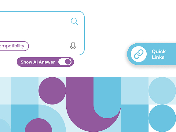
Drug Monograph Search Redesign
UI Design
Creator Tool Personas
Illustration
Human Centered Workplace Animation
Motion Graphics
Inclusive Content for Women Animation
Motion Graphics
Illustration System for Small Business Studies
Design System
Illustration
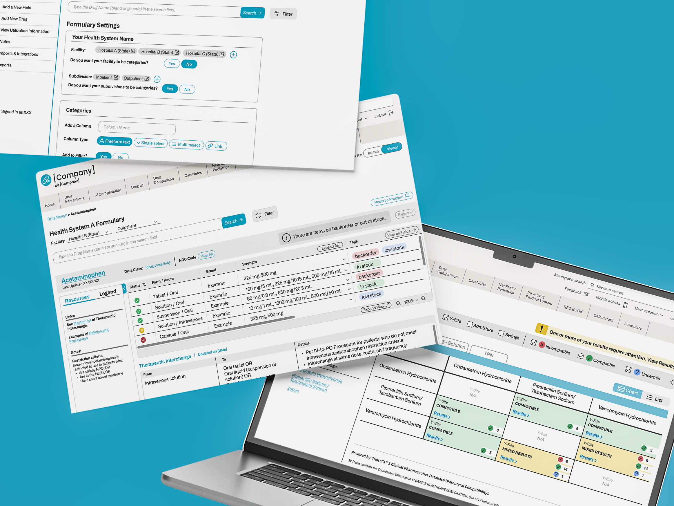
IV Compatibility Tool and Formulary Redesign
UI Design
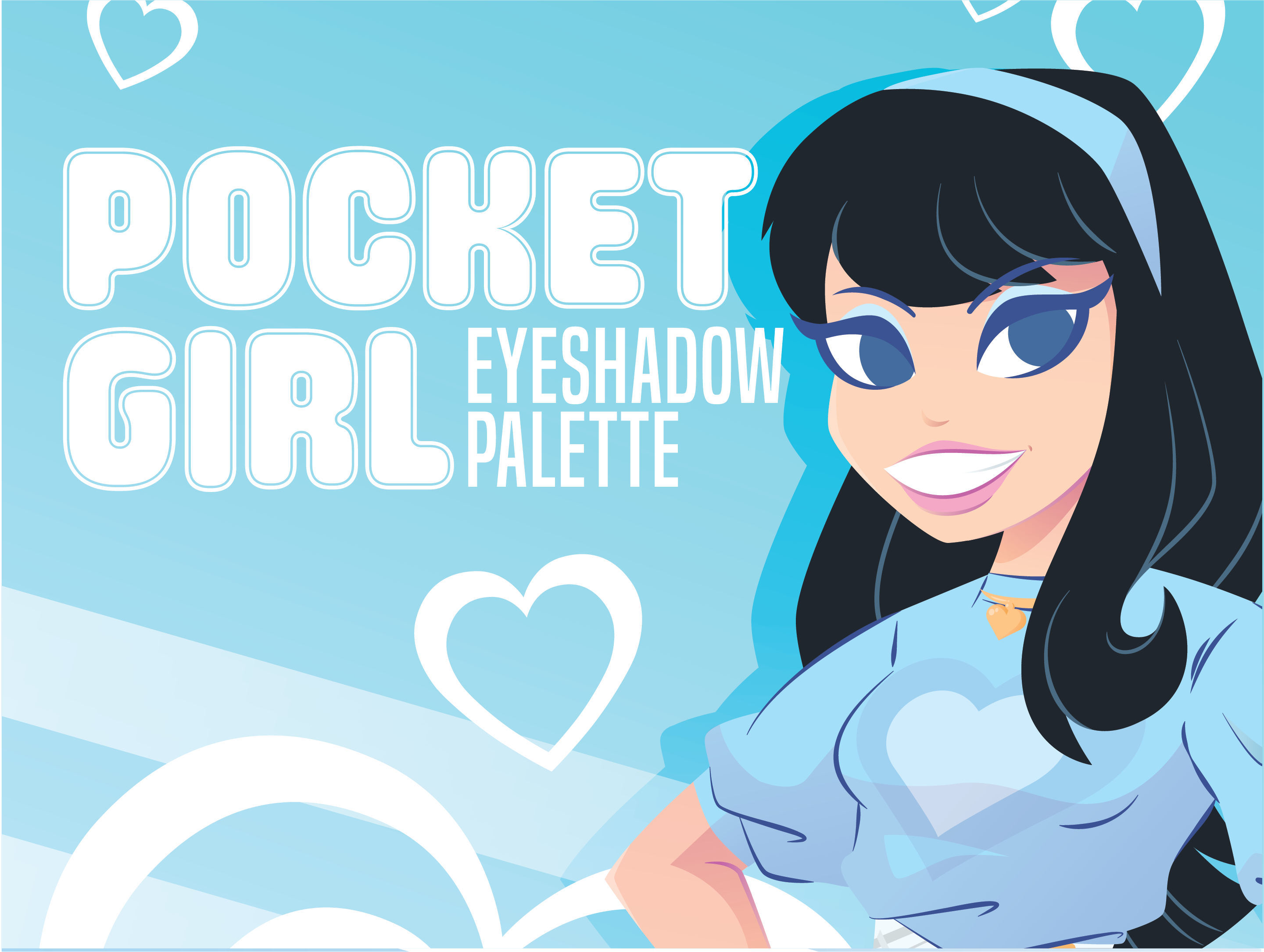
Pocket Girl Eyeshadow Palette
Package Design
Sweet Shoppe Rock Art
Package Design
Zit Zap Acne Patches
Package Design
Ad Design
Motion Graphics
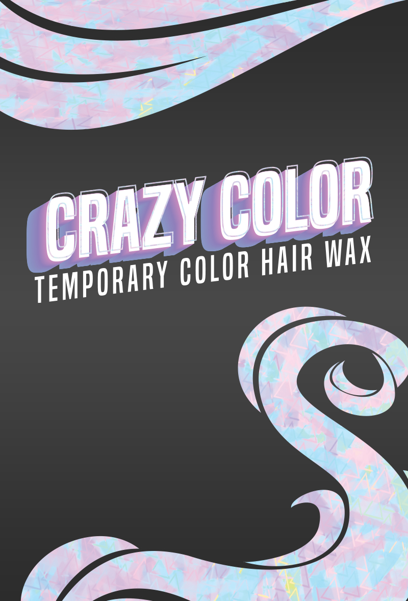
Crazy Color Hair Wax Packaging Design
Package Design
Ad Design
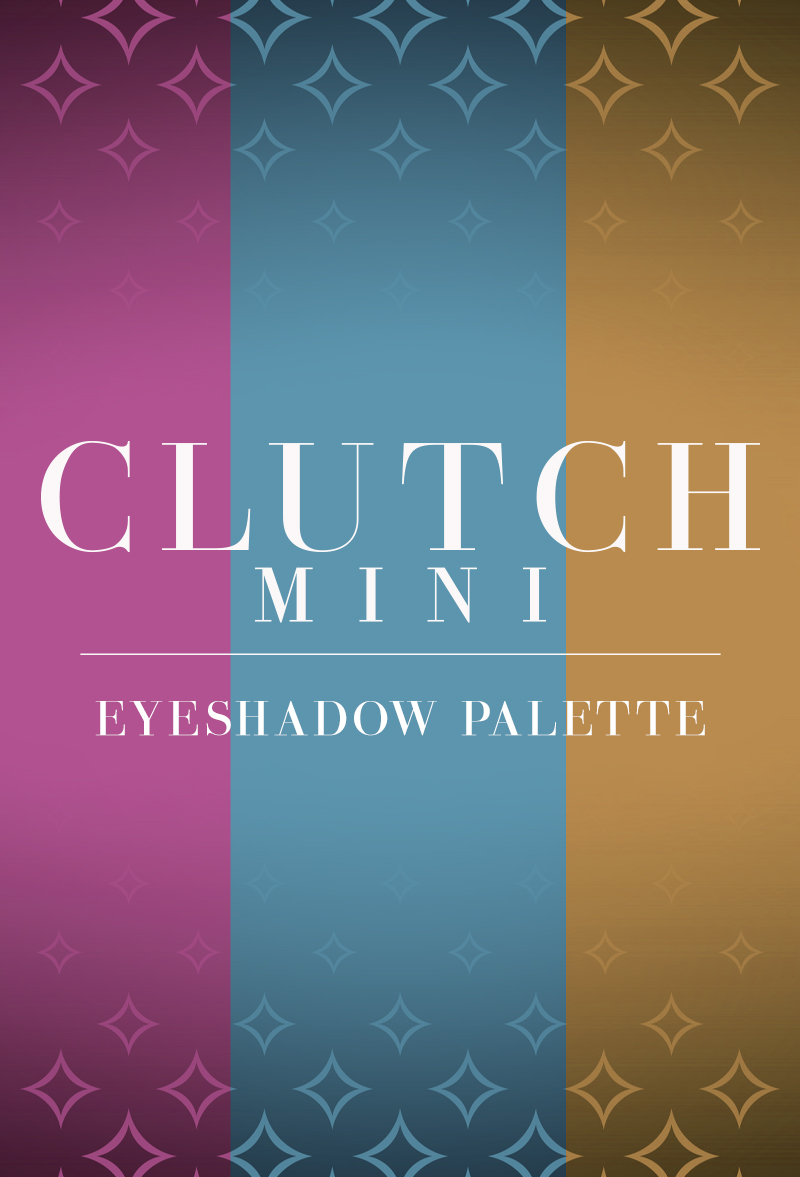
Clutch Mini Palette Collection
Package Design
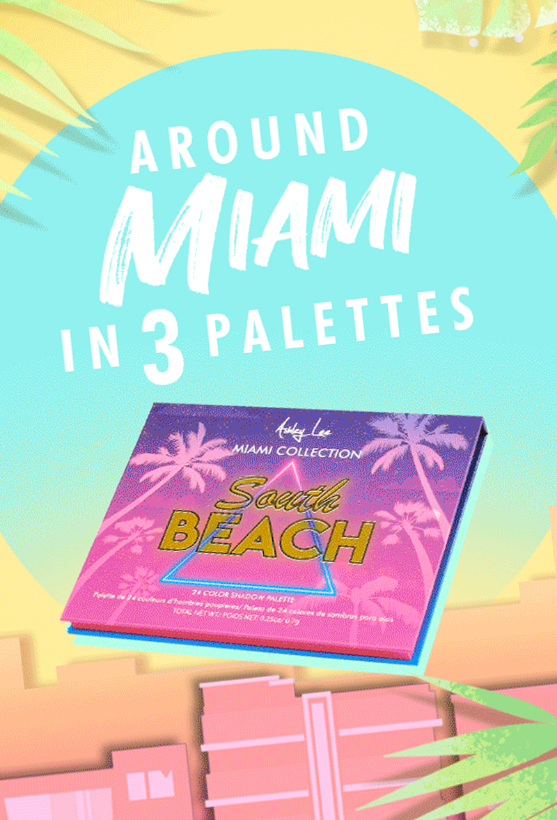
Miami Collection Banner Advertisements
Ad Design
Motion Graphics
Pati Cake
UI Design
305 Beauty Co.
Logo Design
Ad Design
UI Design
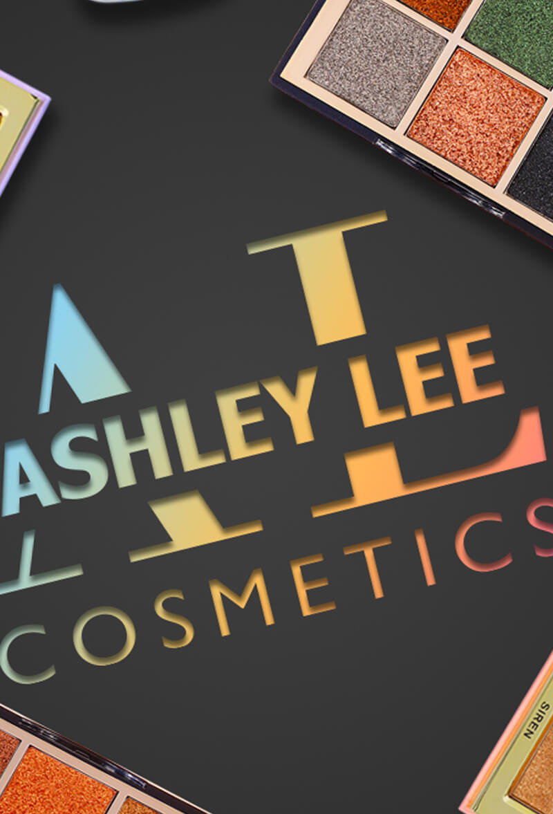
Ashley Lee Cosmetics
Ad Design
Motion Graphics
New Product Campaign
Ad Design
Majesty Trend
Ad Design
Illustration
Logo Design
OES Global, Inc.
Ad Design
Prick Miami
Logo Design